
Form
Why Some Tiled Rooms Feel Calm
How tiled geometry becomes part of a room
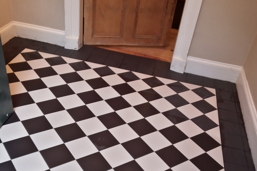
Why do some tiled rooms feel calm while others feel strangely restless? The answer is not minimalism, colour, or style. It lies in how geometry is organised, how tensions are directed, and how tiled surfaces become part of the room rather than competing with it.
Tiles do more than cover surfaces. They introduce geometry into a room. Every joint, edge, border, and transition creates relationships for the eye to read.
Good tiling is the art of making that geometry belong.
Order, Relationship, and Restraint
I think calmness in interior design is one of those words that everyone understands intuitively but very few people define carefully.
My own view is that calmness is not a property of the room itself. It is a property of the relationship between the room and the observer.
A calm room is a room that can be understood with little effort. It presents enough order that the eye knows what it is looking at and where to look next.
One mistake often made is to equate calmness with minimalism, neutrality, white walls, or the absence of ornament.
These things may contribute to calmness, but they are neither necessary nor sufficient.
Many minimalist interiors feel surprisingly restless. Conversely, many richly detailed interiors feel remarkably calm despite containing enormous amounts of visual information.
In my view, calmness is not a matter of quantity but of order, relationship, and restraint.

How Tiles Organise Space
Not all materials organise space in the same way.
Painted plaster can absorb small imperfections because the surface remains visually continuous. Timber has grain that softens precision. Natural stone often disguises irregularities through variation.
Tiles are different.
They transform a surface into a geometric system. Every tile repeats a module. Every joint creates a line. Every edge produces a shadow. Once tiled, a wall or floor becomes a grid that the eye continuously reads, whether consciously or not.
Tiling introduces a powerful geometric presence into a room.
To borrow a metaphor, a tiler brings an elephant into the room and must somehow make it look as though it has always lived there.
Every joint, edge, border, and transition creates a new relationship for the eye to read. Good tiling depends on controlling where these tensions are introduced and how they contribute to the overall order of the room.
Layout, Tension, and Hierarchy
Every space needs an organising order.
This does not always mean symmetry, but it does mean that the eye should understand where the pattern begins, where it is centred, and how it relates to the room.
Symmetry tends to make a tiled surface recede into the background. Asymmetry brings it forward. It creates tension, direction, and focal points.
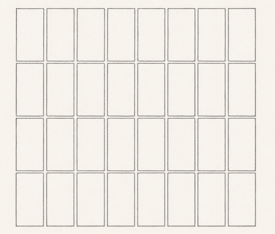
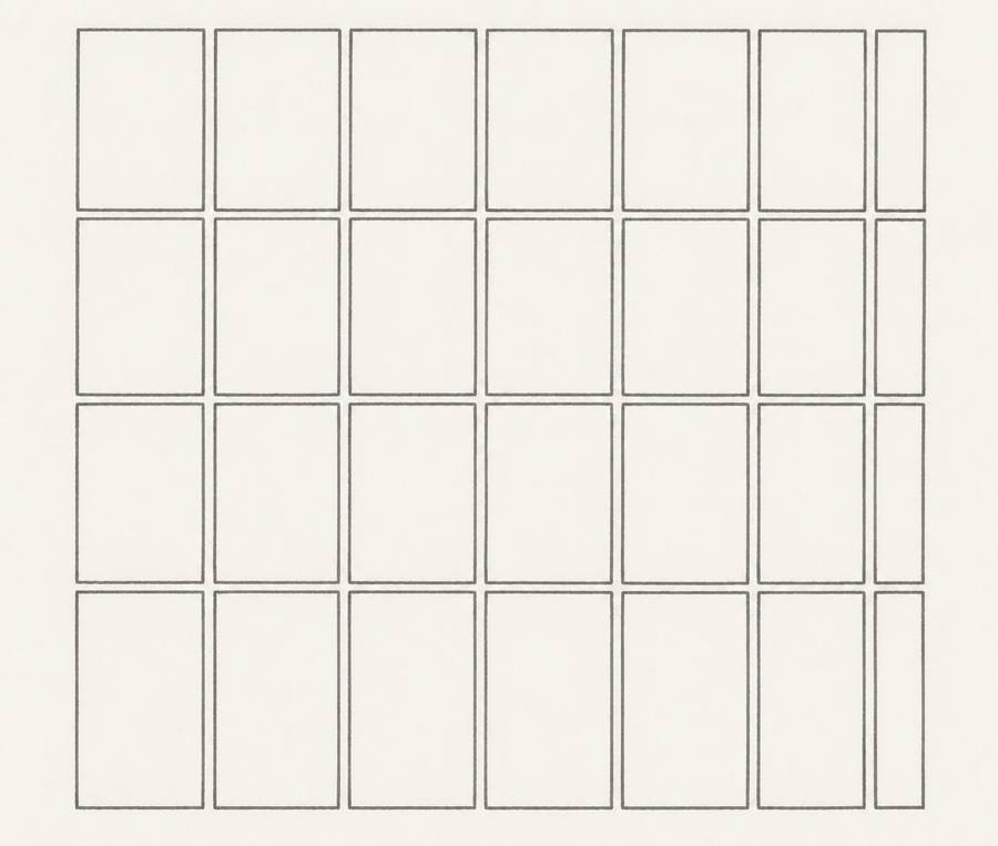
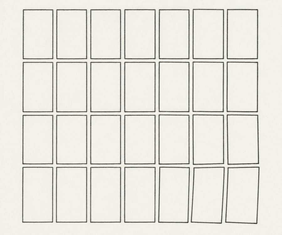
Yet a room without tension is dead. The eye needs moments of emphasis, contrast, and movement. These are what give a room character and life.
Calmness is not the absence of tension. We do not want to eliminate tension but to make it intelligible, directed, and restrained. The room should know where to be quiet and where to be emphatic.
Problems often arise when there is no clear hierarchy. As tilers, we usually organise the layout around focal points. We do not want lines, cuts, borders, niches, trims, and feature tiles competing for attention. The eye should know where to look first and where to look next. Otherwise, a room can be technically tidy yet still feel unsettled.
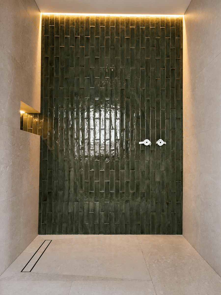
Good layout gives tiled geometry a sense of order. It decides what should lead, what should support, and what should quietly disappear into the background.
Grout and the Visibility of Geometry
Grout is often treated as a purely technical necessity, yet it plays a major role in how tiled surfaces are perceived.
Every grout joint reinforces the geometry of the surface. High-contrast grout makes the grid more visible; low-contrast grout allows it to recede.
Neither approach is inherently correct. A visible grid can create clarity and rhythm, but it also increases visual activity. A quieter grout colour allows the surface to read more continuously and with less interruption.
Joint width behaves in a similar way. Wider joints strengthen the visibility of repetition, while narrow joints create a more unified surface.
Small disruptions can change how a surface is perceived, because the eye naturally seeks order and notices when that order is disturbed.
This is why grout can dramatically change the atmosphere of a room even when the tiles themselves remain identical.
Tile Edges and Shadow Rhythm
Tile edges influence perception in a surprisingly direct way because they control how light behaves across the surface.
A sharp bevel creates concentrated highlights and repeated shadow lines. Every tile edge becomes more visually pronounced. As light moves across the wall, the geometry becomes increasingly articulated.
Cushioned or softened edges behave differently. Reflections disperse more gradually. Shadow transitions become quieter. The grid remains visible, but less emphatic.
Rectified tiles produce yet another effect. Their precision allows joints to become extremely narrow, reducing interruption and creating a more continuous reading of the surface.
Across an entire room, these small differences accumulate into very different spatial experiences.
Some tiled rooms feel calm because the geometry is moderated. Others feel restless because every edge continuously reinforces the grid.
Borders, Corners, and Resolution
Tiled geometry does not only need to exist; it also needs to resolve.
This is one reason why borders have historically been so important in tiled floors. A border is not merely decorative. It gives the geometry a clear conclusion. It frames the system and allows the pattern to end deliberately rather than abruptly dissolving at the edges of the room.
Corners matter for similar reasons.
When grout lines continue cleanly through corners, the geometry remains coherent despite the change in direction. But when joints drift, trims interrupt the rhythm, or cuts become awkward, the continuity begins to weaken.
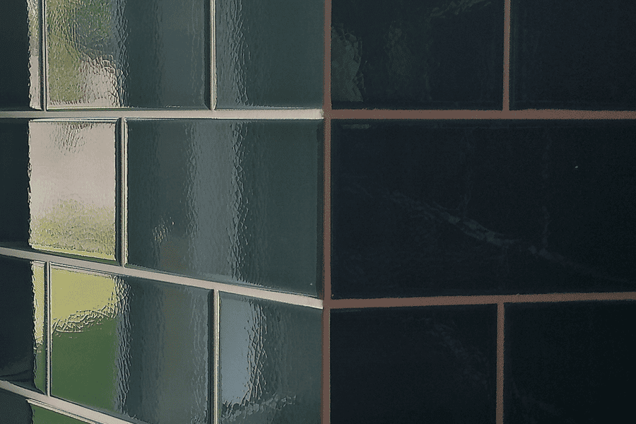
Many people experience this instinctively without consciously analysing it. The room simply feels calmer when the geometry resolves naturally.
The eye is remarkably sensitive to irregularities. When lines that should align fail to do so, or when relationships appear unresolved, attention is drawn almost automatically to the point of tension.
This is also why small inconsistencies can sometimes feel disproportionately disturbing in tiled interiors. Because tiled surfaces operate as visible systems, even minor interruptions become part of the overall rhythm of the room.
Reflection and Visual Activity
Glossy tiles introduce another layer of geometry through reflection.
Light striking the surface creates moving highlights, secondary lines, and shifting contrasts. In moderation, this can give tiled surfaces depth and vitality. Excessive reflections, however, can fragment the visual field and increase perceptual tension.
This is particularly noticeable when strong reflections combine with bevelled edges, high grout contrast, multiple lighting sources, irregular alignment, or dramatic surface variation.
The eye is no longer reading only the tile geometry itself, but also an additional geometry created by light.
This is why lighting and tiling can never be considered separately. Light does not merely illuminate tiled surfaces; it actively participates in how their geometry is perceived.
Calmness Is Not Simplicity
Some of the calmest tiled interiors are not minimal at all.
Victorian floors, Roman mosaics, and many traditional tiled spaces contain enormous visual richness. Yet they often feel stable because their geometry operates within a coherent system. Meanwhile, a completely white bathroom may feel visually nervous if joints, edges, reflections, and contrasts compete for attention.

Calmness, therefore, is not the absence of pattern, joints, or geometry. It is the successful organisation of them.
What Good Tiling Often Does
Good tiling does not merely attach tiles to a surface.
At its best, it organises visual rhythm.
Good tiling does not make the geometry disappear. It makes the geometry belong. It gives the eye enough structure to understand the room without constantly demanding attention.
Perhaps this is why some tiled interiors continue to feel right many years later, even after styles and fashions have changed.